

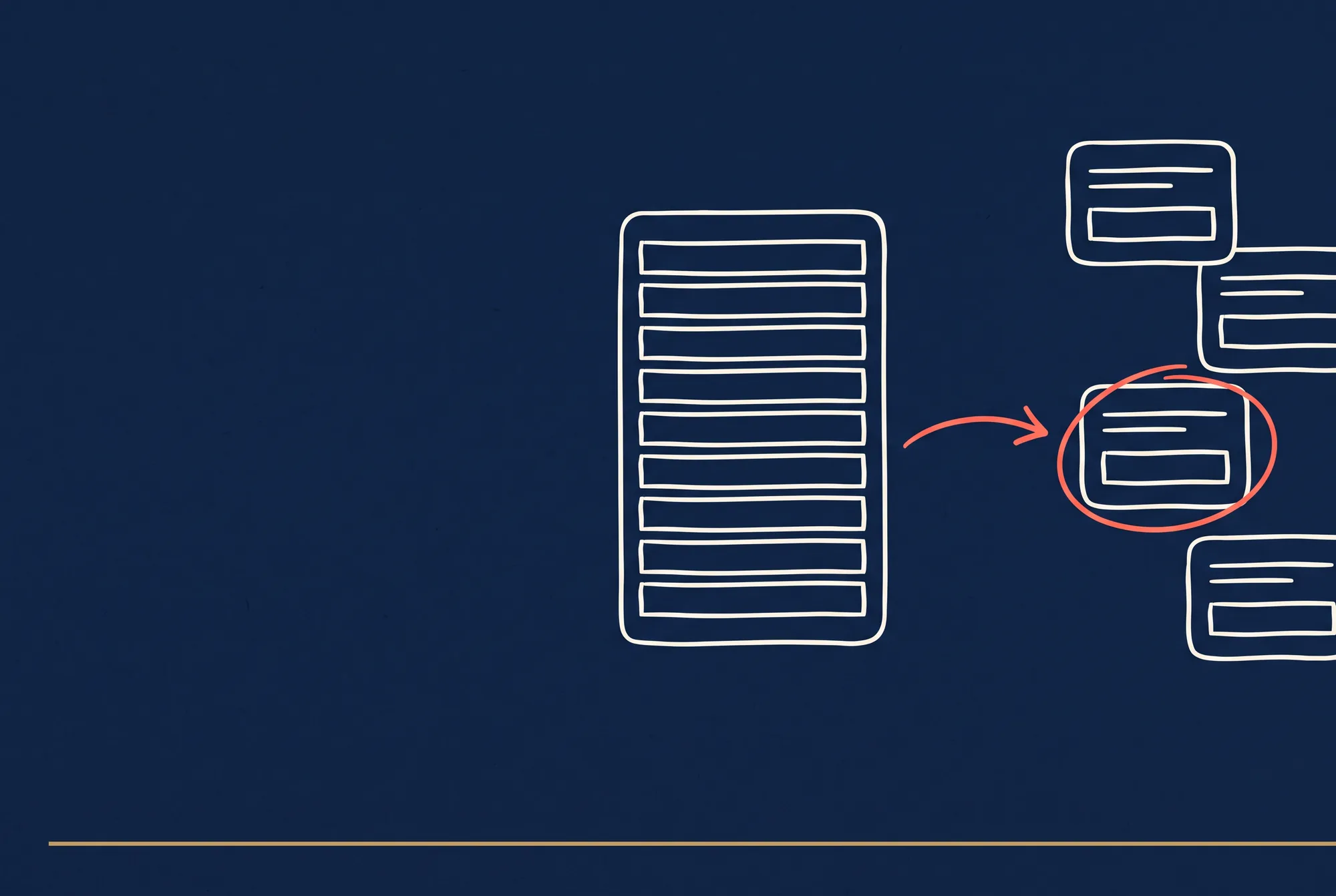

The psychology behind why one question at a time converts three to four times better than a traditional multi-field form.
Who this is for
Anyone shipping a form that matters. Lead capture, onboarding, application, checkout, survey, quiz. Solo founders, product managers, marketers, UX designers, and the developer who has to actually build what they designed.
This is a short playbook. Five parts, no filler. The value is the psychology and the patterns, not the word count.
What is in this playbook
- Part 1, Why Conversational Forms Actually Convert
- Part 2, The 3 Psychology Principles That Drive the Design
- Part 3, The 4 Engagement Patterns to Install
- Part 4, Digital Nudges and the Ethical Boundary
- Part 5, The Implementation Checklist and 8 Common Failures
Part 1, Why Conversational Forms Actually Convert
Typeform reshaped form design in 2014 by proving one question at a time outconverted one-page multi-field forms dramatically. The underlying mechanism was not UI novelty. It was a specific stack of applied behavioral psychology: cognitive load reduction, motivational framing, and progress-driven engagement. Any form can install the same stack and see similar lift.
The research and the numbers
What conversational forms are NOT
A form that has one question per screen but still feels like a form does not produce the lift. The visual pattern is the surface; the psychology is the substrate. The checklist is:
- One question visible at a time (visual)
- Motivational framing in the copy (psychological)
- Progress signal reducing cognitive load (psychological)
- Zeigarnik-driven pull to complete (psychological)
- Micro-celebration on each completion (psychological)
Miss any of the psychological pieces and the visual pattern does not carry the work alone.
The mechanism in one sentence
Conversational forms work because they mimic the cognitive and emotional structure of a two-way human conversation, which is the format the human brain evolved to handle most naturally. Static multi-field forms impose a batch-input pattern that does not match human cognition. The gap is large and measurable.
The rest of the Massive Impact library builds on patterns like this. See the full set at the Massive Impact resource library.
Part 2, The 3 Psychology Principles That Drive the Design
Principle 1, Fogg's Behavior Model (B=MAP)
BJ Fogg's model at Stanford's Behavior Design Lab is the foundation:
Behavior = Motivation × Ability × Prompt
For a user to take an action, all three elements must be present at the same time. If any one is zero, the action does not happen.
- Motivation: the user's internal desire or external incentive to act. Emotional language, clear benefit statements, and progress celebration drive motivation.
- Ability: how easy the action is. Reducing the number of fields, pre-filling what you can, and presenting one question at a time all increase ability.
- Prompt: the trigger to act right now. Micro-copy nudges, social proof, and well-timed CTAs are the prompt.
Conversational forms systematically amplify all three:
- Motivation through conversational language and celebration
- Ability through one-question-at-a-time simplification
- Prompt through micro-copy and progress-driven momentum
A static 20-field form attacks ability directly (too hard) and offers almost no motivation or prompt support. The conversion gap is the predictable consequence.
Principle 2, Cognitive Load Reduction
Cognitive load theory (John Sweller, 1988 and onward) identifies three kinds of cognitive load a task imposes:
- Intrinsic load: inherent complexity of the task (you cannot reduce this)
- Extraneous load: complexity added by how the task is presented (this is what form design controls)
- Germane load: effort spent building understanding (good forms move some load here)
A 20-field form with multiple columns, simultaneous validation errors, and no clear progress indicator carries enormous extraneous load. A one-question-per-screen form carries almost none. Same intrinsic load (same information requested); dramatically different extraneous load.
Working memory holds roughly 4 to 7 discrete items at once. Every additional field visible on screen competes for that limited capacity. One question at a time keeps working memory at 1 item, freeing capacity for the user to actually think about their answer rather than parse the form structure.
Principle 3, The Zeigarnik Effect
Bluma Zeigarnik's 1927 finding: incomplete tasks are remembered and psychologically attended to significantly more than completed tasks. The cognitive tension of an incomplete task creates a pull toward completion.
Conversational forms exploit this at two levels:
- Within-form: a progress bar showing "Question 3 of 7" creates an incomplete-task tension that pulls the user forward. "You're almost done" triggers the effect explicitly.
- Return-to-form: an abandoned conversational form with 40 percent completion pulls the user back more strongly than an abandoned static form (which the user perceives as never started).
The effect is not unlimited. Past a certain number of questions (around 10 to 12 in most research), Zeigarnik's pull is overwhelmed by fatigue. Conversational forms typically stay under this threshold for lead capture; longer flows (full applications, onboarding wizards) deliberately chunk into phases with intermediate celebrations to reset the pull.
Part 3, The 4 Engagement Patterns to Install
The patterns that translate the three principles above into working form UI.
Pattern 1, One Question at a Time
The Typeform signature. Each question occupies the full screen; the user answers; the next question slides in.
Why it works:
- Ability (Fogg): the user's task at any moment is to answer ONE question. Cognitively trivial.
- Cognitive load: extraneous load approaches zero.
- Motivation: every answer is a micro-win, triggering a small dopamine response.
Where it breaks: tasks where the user genuinely needs to see multiple fields together (price comparison, side-by-side choice, table data). Force one-at-a-time on these and you destroy usability. Most form content does not fall into this category.
Implementation: screen per question, smooth transition, clear progress indicator, keyboard-driven if possible (enter key advances, arrow keys move). Avoid paginated forms that feel like chapter breaks; the transitions should feel like a natural conversation pace.
Pattern 2, Progressive Disclosure
Information appears as the user earns it through answers. Later questions change based on earlier answers. The form feels custom-fitted rather than generic.
Why it works:
- Ability (Fogg): the user never sees irrelevant fields.
- Cognitive load: total visible content stays low.
- Motivation: the form responding to the user's inputs feels like an attentive conversation, not a broadcast survey.
Where it breaks: when the branching logic becomes visible to the user (e.g., a field disappears suddenly, or the user backtracks and sees contradictory paths). Branching must be invisible and consistent.
Implementation: conditional logic in the form builder or state machine, validated with QA across every possible path. Never more than 2 to 3 meaningful branches per field.
Pattern 3, Zeigarnik-Driven Progress
The form displays its own incomplete state prominently, triggering the pull to complete.
Why it works:
- Zeigarnik effect: direct activation.
- Motivation: visible progress is itself a motivation source.
Where it breaks: progress bars that jump or behave non-monotonically (a percent that decreases because the user revealed a new branch) actively reduce motivation. Progress must move forward consistently or not at all.
Implementation: percent bar, step counter ("Question 4 of 9"), or a visual spine filling in. For long multi-phase forms, phase-level progress plus overall progress works better than a single bar.
Pattern 4, Conversational Language
Questions and micro-copy use natural, benefit-focused language in second person. The form feels written by a person, not generated by a database schema.
Side-by-side comparison:
| Database-speak | Conversational |
|---|---|
| "Enter your email" | "What's the best email to reach you?" |
| "Phone (required)" | "And a phone number in case we need to call?" |
| "Submit" | "You're all set, let's go" |
| "Error: invalid format" | "That email looks off. Can you double-check?" |
| "Select one option" | "Which one sounds most like you?" |
Why it works:
- Motivation (Fogg): emotional connection, not transactional friction.
- Cognitive load: natural language parses faster than database-speak.
- Zeigarnik: the conversational tone keeps the user inside the conversation flow, not tempted to leave.
Where it breaks: over-friendly copy that feels fake, especially in high-stakes or professional contexts. Tone must match the brand and the content. A legal intake form should NOT sound like a casual chat. Conversational language is not always cheerful; it is natural for the context.
This pattern is one piece of a wider toolkit. Adjacent playbooks at the Massive Impact resource library.
Part 4, Digital Nudges and the Ethical Boundary
The four patterns above are the mechanics. Nudges are the amplifier. Applied carefully, they lift conversion further; applied recklessly, they cross into dark-pattern territory.
Nudge 1, Social Proof
- "5,000 founders joined this week."
- "Most popular choice for practices over 10 years."
- Avatars or logo strip of recognizable users.
Effective when true. A fabricated "5,000 founders" count is both unethical and legally risky in most jurisdictions. Use real numbers or do not use numbers.
Nudge 2, Gamification
- Progress bars, step counts, completion percentages.
- Badges or milestones on long-form flows.
- Streaks (applies more to daily-use apps than to one-time forms).
Effective when the game loop is real. A progress bar that never reaches 100 percent because there is a hidden upsell after is a dark pattern.
Nudge 3, Micro-Copy Prompts
Small copy that reduces specific friction:
- "This will only take 2 minutes." (sets expectation)
- "You can change this later." (reduces commitment anxiety)
- "No credit card required." (removes barrier)
- "We will never share your email." (addresses concern)
- "Skip this if it does not apply." (reduces stuck-at-field abandonment)
Each of these is a prompt (Fogg) targeting a specific friction point. Install them at the moment of highest friction.
Nudge 4, Celebration and Feedback
- Confetti or a check animation on form completion.
- "Great choice" or "Perfect" micro-copy after selections.
- Visual confirmation of each answer before the next question appears.
Celebration amplifies motivation (Fogg) and closes the Zeigarnik tension for that question, releasing attention for the next. Keep it small; large celebrations on trivial actions feel patronizing.
The ethical line: nudges vs dark patterns
The difference is simple: a nudge helps the user do what they already want; a dark pattern manipulates the user into doing what the company wants but the user does not.
Clear examples on each side:
Nudges (ethical):
- "You're 80 percent done" on a form the user chose to start
- "No credit card required" at signup for a product the user evaluated
- Pre-filled defaults for common answers (with clear option to change)
Dark patterns (unethical and increasingly illegal):
- Pre-checked "I accept marketing emails" boxes
- Confusing cancel flows that take more steps than signup
- "Confirmshaming": buttons like "No, I don't want to save money"
- Fake urgency ("Only 2 left!" when there are thousands)
- Fake social proof (manufactured review counts, bot-generated testimonials)
The FTC in 2023 and 2024 began enforcing against dark patterns explicitly. Multiple SaaS companies have paid settlements. The European Digital Services Act (fully active by 2024) specifically prohibits confusing cancel flows and manipulative defaults. The regulatory environment in 2026 is materially worse than it was in 2022 for dark patterns.
The working definition to use during design:
If we showed this form flow to the user and explained exactly what every pattern was doing and why, would they still use it? If yes, it is a nudge. If no, it is a dark pattern.
This test catches most failure modes at the design stage.
Part 5, The Implementation Checklist and 8 Common Failures
The implementation checklist
Before shipping any conversational form, verify these 20 items grouped by principle.
Fogg B=MAP
- Every question is one simple action (no compound questions)
- Motivation copy appears at or before the first question (what the user gets from completing)
- At least one explicit prompt appears at the start (social proof, benefit, or urgency that is real)
- The longest question takes no more than 30 seconds of user effort
Cognitive Load
- One question visible per screen
- No more than one input element per question (no "enter name AND phone in one screen")
- Pre-fill anything you can infer (IP-based country, current date, account data)
- No validation errors shown inline simultaneously; validate one at a time
- Error messages are in plain English, not error codes
Zeigarnik
- Progress indicator visible on every screen
- Progress monotonic (never jumps backwards)
- Completion percentage or step count visible
- "Almost done" micro-copy fires around 70 to 80 percent
Conversational Language
- Every question reads like a person asked it
- Second person throughout ("you", "your")
- No database-speak in any visible copy
- Tone matches the brand and the context (not universally cheerful; appropriately natural)
Ethics
- No pre-checked consent boxes
- Cancel or skip paths visible and not buried
- All social proof numbers are real
- All claims (time estimates, required fields) are accurate
The 8 common failures that break conversational forms in production
Failure 1, One question at a time but still feels like a form
The visual pattern is applied without the psychology. Fields are still labeled with database-speak, the progress bar is missing, there is no celebration on answers. Looks conversational; reads mechanical.
Fix: apply the checklist above. The visual is not enough.
Failure 2, Progressive disclosure that feels inconsistent
Branching logic causes the same user to see different paths on different sessions, or the progress bar jumps. The user feels something is broken.
Fix: make branching deterministic (same answers → same path). Make progress monotonic even across branches.
Failure 3, Fake social proof
"5,247 people signed up today" when the actual number is 12. Users increasingly detect this (especially younger audiences). When they do, trust collapses.
Fix: use real numbers. If real numbers are small, use different social proof (single prominent testimonial, a named partner, a specific case study).
Failure 4, Too many questions
Past 10 to 12 questions, Zeigarnik fatigue sets in. Completion rates drop regardless of how well-designed the form is.
Fix: split into multi-phase flows with celebration and save-point between phases. Or cut questions that do not genuinely qualify or personalize.
Failure 5, Forced fields that should be optional
Every required field the user does not want to provide creates abandonment. Phone when email is enough, date of birth when age range is enough, full address when ZIP is enough.
Fix: make everything optional that is not strictly required for the conversion's core purpose. Mark required fields clearly; default to optional.
Failure 6, No save-and-continue on longer forms
A 15-question form with no ability to resume later loses every user who gets interrupted. Even a conversational form loses Zeigarnik advantage if the user cannot come back to the incomplete state.
Fix: automatic save per answer (via local state and / or server-side draft record). Clear resume link in email.
Failure 7, Broken keyboard navigation
Power users (a significant share on B2B forms) want to tab and enter-key through a form. Breaking this on a conversational form feels more broken than on a static one.
Fix: every input accepts keyboard advancement. Enter advances. Escape goes back. Arrow keys work on multi-select.
Failure 8, Celebration that feels patronizing
Confetti on "What's your name?" is absurd. Excessive "Great answer!" after every selection reads as fake.
Fix: celebrate milestones (quarter, half, three-quarter, complete), not individual answers. Use small check-marks and quiet feedback on individual answers instead of loud celebration.
There is more where this came from. For deeper playbooks on funnel design, conversion architecture, AI search visibility, and professional services marketing, visit winmassiveimpact.com
The mechanics are predictable. The psychology is decades old. The conversion gap between a well-built conversational form and a static equivalent is large, measurable, and replicable. If your current form looks conversational but is not producing the lift, the checklist in Part 5 is the audit.
The rest of the guide is yours, free.
Enter your email to keep reading and get the PDF to keep.
No spam. One email unlocks every Massive Impact resource.
“We can see through the different sections and the forms, a clearer path of how that lead becomes an actual booking.”
The service behind this
More from the library
